Showing posts with label Andy Warhol. Show all posts

16 February 2016

Warhol at the Ashmolean

A survey of mid to late Warhol which should not be missed

Oxford seems to have a thing about Warhol. As recently as last March Modern Art Oxford was showing Love is Enough: William Morris & Andy Warhol curated by Jeremy Deller. Perhaps it derives from Warhol’s only visit, made in 1980 when he escaped from London to a party in north Oxford. Now, Andy Warhol: Works from the Hall Collection is at the Ashmolean Museum. The Hall and Hall Art Foundation was set up in Vermont in 2007 by Andrew and Christine Hall and holds about 5000 modern and contemporary works by numerous artists. Andrew Hall is an Oxford graduate who manages a hedge fund in the US. The Foundation loans its own works and those in the Halls’ own collection and has a partnership with the Ashmolean to present a series of exhibitions curated by Sir Norman Rosenthal.

This exhibition begins with Warhol in the 1960s, the period when he was establishing “The Factory” and producing silkscreen images - Self-portrait (1967, in the poster above) and copies of iconic objects - Brillo Soap Pads Box (1964, below right):


Part of the fascination of the multiple screen prints is the extent of the variations In the same run, apparent when looking at the eight prints of The American Man (Portrait of Watson Powell), (1964, above left) in the show, out of the 32 produced. There is also an opportunity to see some of the portrait films Warhol was making at this time – the four minute shorts of Marcel Duchamp (curiously, almost as conventionally respectable in appearance as René Magritte) and Bob Dylan being more likely to be watched in full by visitors than the eight hours static view of the Empire State Building.

The 70s Portraits begins with one image of a politician, Willy Brandt (1976, below top) and several prints on various media of the artist Joseph Beuys (1980, below lower):

before, almost inevitably, the Great Helmsman with Mao (1973, left) and Twenty Fuchsia Maos (1979, right):


Most striking in this section was the wall of Celebrity Portraits. Just to pick out two of interest: Pia Miller (c1985, below left) apparently introduced Ai Weiwei’s work to the West as recently as 2008, and Farah Ashraf Pahlavi (Princess of Iran) (1977, below right) established with her cousin (also portrayed by Warhol) the Tehran Museum of Contemporary Art, an exceptional collection little seen since 1979 but, according to the Financial Times last December, about to re-emerge and start lending.


Nearby are some Experiments In Abstraction including the Untitled (Oxidation Painting) (1978, below left), produced, we are told, by urinating onto copper, and some jollier handprints and Hammer and Sickle (1976, below right):


The final section, The Last Year, actually covering 1985 to Warhol’s untimely death in February 1987, was well-stocked but less interesting. He was producing black and white images inverted to provide positive and negative versions, eg Hamburger (positive) (1985‒86, below top) and the Map of the Eastern U.S.S.R. Missile Bases (1985-86, below lower, negative; for the positive see the Modern Art Oxford show post): 


Nearby on the gallery wall was a quotation from the artist:
Black is my favourite colour and white is my favourite colour
No point in laboring what might be wrong with that!

This exhibition provides a welcome opportunity to see a selection of Warhol's later work. Anyone unfamiliar with his career might be frustrated by the lack of context it provided – I didn’t see the usual timeline at the entrance - so some preliminary reading could be helpful, say 15 minutes’ worth?

Andy Warhol: Works from the Hall Collection continues at the Ashmolean until 15 May.


8 January 2016

Three Paris Exhibitions: (1) Picasso

Shows seen last month in a city subdued and uncrowded after les évènements of 13 December


While in Paris, I came across an article by Robin Pogrebin in the International New York Times about developments at the Museum of Modern Art (MoMA) in New York. Back in 2010, a NYT art critic had described MoMA’s conventional wisdom as “a reluctance to question the linear unspooling of art history according to designated styles that remains the Modern’s core value and its Achilles’ heel”. Now, MoMA’s chief curator of painting and sculpture was being quoted as saying that the museum was “reflecting a more widespread shift from thinking in categories – or thinking in so-called canonical narratives – to thinking about multiple histories. Having a sense of curiosity, rather than a desire for pronouncement.” Of the three exhibitions in Paris, the first two, Picasso.Mania at the Grand Palais (described below) and Splendeurs et Misères, can probably be regarded as concerned with multiple histories, the third, Villa Flora (to follow), probably not.

Shows at the Grand Palais aren’t what they used to be. By comparison with their major retrospectives, Georges Braque in 2013 and Edward Hopper in 2012, Picasso.Mania seemed thin stuff. Its thesis was apparently that
After World War II, Picasso became renowned as a modern artistic genius. This public recognition came at a time when contemporary art was once again moving towards “avant-gardism”. This movement’s values, as incarnated by Marcel Duchamp, were in contradiction with Pablo Picasso’s flamboyant subjectivity, media presence and commercial success. As a result, it was only in 1971 that a collective tribute by living artists from different disciplines was organised for the artist’s 90th birthday. In the 1980s, exhibitions showed a new generation of artists how Picasso’s later works were years ahead of his time.
A proposition which was not exactly supported by telling visitors that in the 1960s Roy Lichtenstein was inspired by Picasso and that David Hockney was a repeat visitor to the Picasso exhibition at the Tate in 1960. The show made a good initial impression with Sort of Fabulous (2015), a video installation of 18 artists talking about the impact of Picasso on their work, including Jeff Koons, Frank Gehry, Thomas Houseago and Cecily Brown. An unspooling of art history then followed, starting with All hail the artist!, the Self-Portrait of 1901 (below left), borrowed from the Picasso Museum, and some recent images of the artist including Van Pei Ming’s Portrait of Picasso (2009, below centre) and Rudolf Stingel’s Untitled (2012, below right):


and some of the 90th birthday lithographs from 1971:


The most successful of the exhibition themes which followed was probably that given over to cubism – a wall of Picassos:


and then a homage in the form of various works, many by David Hockney, beginning with his Artist and Model (1973/4, below left) and Harlequin (1975, below right):


From the 1980s onwards Hockney explored multiple viewpoints evoking cubism (“a kind of mechanical cubism”) in, for example, Paint Trolley, LA (1985, below top) and Place Ferstenberg, Paris, August 7, 8, 9 (1985, below lower):


More recent Hockney works were The Jugglers, June 24th 2012 (2012, below), 18 films on 18 screens shown over 22 minutes:


and A Bigger Card Players (2015), as at Annely Juda Fine Art, London last summer. After that, the show began to meander. Picasso on screen projected on three walls clips from a wide variety of films (below) in which either the painter or his works or both appear, ranging from Truffaut’s Jules et Jim to Jean-Luc Godard’s King Lear to Woody Allen’s Midnight in Paris.


Demoiselles from elsewhere and Guernica, a political icon were both Hamlet without the prince, the originals not being available. Various works inspired by Les Demoiselles d’Avignon (1907), included Untitled by Sigmar Polke (2006, below top) and Jeff Koons’ Antiquity (2011, below lower):


Of the works pertinent to Guernica, one of the most interesting to British eyes was Goshka Macuga’s construction, The Nature of the Beast (2009), commissioned by the Whitechapel Gallery in memory of their having exhibited Guernica in 1939 and now owned by the Castello di Rivoli (below left). Part of the work is a glazed circular table which exhibits documents relating to the Spanish civil war and more recent conflicts. I thought the photographs from the Whitechapel’s archive of Clement Attlee in 1939 were thought-provoking (below right) – there is a mention of the Major Attlee Company (sic) in his Wikipedia entry.


After this, a section, It’s a Picasso!, grouped his paintings and prints from the late 1930s and later:


and then some pieces relevant to Picasso and Pop art’s reaction to abstract expressionism including Andy Warhol’s Head (after Picasso) No III (1966, below right top) and Roy Lichtenstein’s Still Life after Picasso (1964, below right lower):


Out of what followed, the impact of Picasso on Jasper Johns’ The Seasons (1985 – 87, Summer below left) with, nearby, Picasso’s Minotaure à la carriole (1936, below right) was notable:


A section covering the media attention Picasso received in his later years was followed by a large display of his late works, some reminiscent of Japanese shunga, seen at Avignon in 1970 and 1973. The final theme was the impact on artists in New York of the Guggenheim’s 1984 Picasso show, for example Jean-Michel Basquiat’s Untitled (Pablo Picasso) (1984, below):


Picasso.Mania ends on 29 February 2016.


3 December 2015

A Visit to the Guggenheim Bilbao

A post here in May described A Visit to the Fondation Louis Vuitton in Paris. This is a companion piece following a visit during the summer of 2015 to the Guggenheim Museum in Bilbao, also designed by Frank Gehry. 


After the collapse of its industrial base in the 1980s, Bilbao was in desperate need of transformation. In 1991 the local administration and the Guggenheim Foundation reached an agreement to construct a contemporary art gallery on a derelict site next to the estuary and near the city centre. The Foundation had previously commissioned Frank Lloyd Wright for its museum in New York which had opened in 1959. Construction of Gehry’s design for Bilbao, which has become almost as well-known as Wright’s, began in 1993 and the museum opened in 1997. The structure is of steel, the surface being clad in titanium where not glazed and with limestone exposed on the exterior and the interior. The complex curving shapes were designed using computer applications originally developed for aerospace by Dassault in France in the 1970s. The exterior presents different forms at different viewpoints and references Bilbao’s maritime history of ships and fishing.


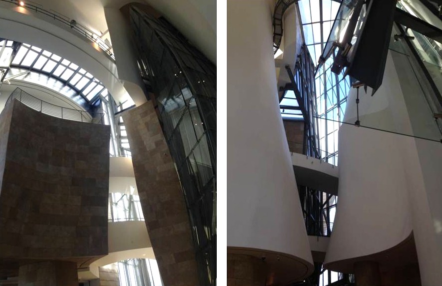
The interior is as just complex, as these views of the atrium reveal:


The Guggenheim Bilbao's permanent collection includes some major site-specific pieces on display externally including Anish Kapoor’s Tall Tree and the Eye (2009, below left) and Louise Bourgeois’ Maman (1999, below right):


and two works by Jeff Koons, Tulips (1995-2004, below top) and Puppy (1992, below lower):


Inside, in the ArcelorMittal gallery, are the seven massive pieces which constitute Richard Serra’s The Matter of Time (2005, below). Made of weathering steel and fabricated locally, they embody Bilbao’s industrial heritage.


At the time of this visit, most of the gallery space was given over to two exhibitions: Jeff Koons: A Retrospective (previously at the Centre Pompidou in Paris and the Whitney Museum of American Art, New York) and Jean-Michel Basquiat: Now’s the Time. People seem either to like Koon’s work or dislike it, not many are indifferent. Michel Houellebecq (quoted in a post here earlier this year) described Koons in unflattering terms as seen through the eyes of another imaginary artist. Julian Barnes at the Edinburgh book festival in August
… offered a text written by American artist Jeff Koons to accompany his work Puppy, a vast sculpture formed from flowering plants belonging to the Guggenheim Bilbao in northern Spain. Reading aloud from Koons’ text, he told the Edinburgh audience that Puppy “helps you have a dialogue about the organic and the inorganic. It’s really about the issue of the baroque, where everything is negotiated. The different aspects of the eternal through biology. Whether you want to serve or be served, love or be loved, all these types of polarities come into play because Puppy sets them up.” Barnes added: “To use the technical term of art criticism, it’s bollocks. I know it’s like shooting fish in a barrel but sometimes fish need to be shot.”
In October Barnes told a Cheltenham Literature Festival audience (including me) that Koons produced “machine-tooled whimsicality”. Jeff Koons: A Retrospective provided plenty of opportunity to make one’s own mind up and included examples of his work from The New Series in the early 1980s (vacuum cleaners in vitrines) to the recent Antiquity series.  I couldn’t help being impressed by the skill of Koons’ technicians in fabricating objects like Lobster (2003, below left), with the appearance of a PVC inflatable but made from “Polychromed aluminum”, and Large Vase of Flowers (1994, below right) made in polychromed wood.


Having seen this show, it may be a while before I feel the need to seek out any more Koons. I was more taken with Basquiat whose work I was seeing for the first time – if BBC Your Paintings is right, he is not represented in any UK public collection. Jean-Michel Basquiat was born in New York in 1960 and died of a heroin overdose in 1988, a year after Andy Warhol who had been his collaborator in the 1980s. Two works which epitomise Basquiat's style and preoccupations are Irony of a Negro Policeman (1981, below left) and Dark Race Horse—Jesse Owens (1983, below right):


Typical of Basquiat’s work with Warhol are Win $ 1,000,000 (below top) and Ailing Ali in Fight of Life (below lower), both 1984:


Man from Naples (1982, below), from Guggenheim Bilbao’s own collection, is a good example of Basquiat’s street graffiti work:


While the Guggenheim Bilbao is probably an even more impressive building than Gehry’s later Fondation Louis Vuitton, I thought it was less visitor-friendly.  The gallery space is less appropriate for exhibitions, particularly retrospectives. The Warhol show was spread over two floors while Basquiat required walking back through galleries 306 and 305 after reaching 307 and then down a corridor to 303 and 302 – not so good, at least on an initial visit. Also, to enter the Museum, visitors descend a flight of steps from street level to the level of the atrium floor level. Leaving is via another flight of steps down to river level. A third set of steps, the length of the other two combined, then has to be climbed to get back to street level. If you want to get back in to the Museum – allowed during the day of visiting – you then redescend the first flight … None of this should deter anyone from visiting in 2016 when Guggenheim Bilbao will be offering shows of works by Warhol and Bourgeois and Windows on the City: The School of Paris, 1900-1945.


11 February 2015

Morris and Warhol at Modern Art Oxford

I had thought of calling this post, Jeremy Deller’s Morris and Warhol at Modern Art Oxford, to recognise its auteur. In fact, the show’s full title does the job: Love is Enough: William Morris & Andy Warhol curated by Jeremy Deller. Deller is a conceptual, video and installation artist who won the Turner Prize in 2004 for a film and who regards Morris and Warhol as his greatest artistic influences. He sees similarities between the two as he explained at length to Stuart Jeffries in the Guardian:
Both established printmaking businesses, both envisaged art not as something done in lonely garrets but through collaboration. One critiqued the industrial culture of the 19th century; the other parodied the industrial culture of the 20th. Both wanted art to be for the people. Both – and this is where Deller is at his most challenging – were political artists. Come on, Warhol political? “The electric chair? The pictures of race riots? There’s more to him than his trademark blankness.” 
Deller takes these politicised Warholian images as parallel to Morris’s political writings almost a century earlier. “Morris wrote furiously about how the crafts skills in India and Malaya were ruined because the British empire wanted cheap mass-produced products. He totally understood the processes and how that affected art making. William Morris was the precursor of modernism.” Really? “He stood for things being beautiful and practical and well made. Bauhaus was a reaction against cheaply made goods. Morris got there long before them.” 
He shows me a political pamphlet Morris wrote called A Factory as It Might Be. “Everyone thinks he’s a luddite. He wanted people to have gardens and grow their own vegetables. But Morris didn’t oppose machines: he thought they were good if they took away demeaning labour.” The factory that the English communist dreamed of was not, Deller argues, so very far away from the Factory that Andy Warhol ran in midtown Manhattan. 
“Both were very much hoping that work might be idyllic,” says Deller. Did Warhol really care about that? “The working environment he created at the Factory is a norm now for creative people. There’s a flow of people from whom you get ideas that feed into the art. I think that William Morris would be very happy that, in 2014, we live in Warhol’s world, that we don’t work in the kind of factories he hated.” He describes Morris as the Warhol of his day, trying to revolutionise the alienating world of industrial work by the means of, incredibly, soft furnishings and floral wallpaper.
And so on. Visitors may or may not be convinced by this line of argument - Richard Derwent in the Daily Telegraph certainly wasn’t:
Nothing I’ve seen in any medium begins to touch the depths of the exhibition Jeremy Deller has put together about what he conceives to be the many points of similarity between two great artists, William Morris and Andy Warhol. But these exist only in his own mind. Virtually every comparison he draws between the two either in the catalogue or in interviews is at best a half-truth, which he then justifies by blatant sophistry.
and later called it one of the worst exhibitions of 2014. Perhaps he made the mistake of seeing this show and the Ashmolean’s William Blake on the same day out. But let’s look on the bright side: the exhibition is free and so is the MAO Exhibition Guide with background essays, eg The Relationship Between the Neural Plumbing and the Agape by Dr Anders Sandberg of the Future of Humity Institute – well we are in Oxford. And those of us who are ill-equipped for that level of appreciation and also aren’t desperate to synthesise the two men’s work, can enjoy the show, with its hundred plus items including books and photographs. MAO has a bigger area available than was the case at the recent National Portrait Gallery William Morris exhibition and makes use of it to show the technique of block-printing wallpaper and one of the large Quest for the Holy Grail Tapestries designed by Burne-Jones, Dearle and Morris, The Attainment; The Vision of the Holy Grail to Sir Galahad, Sir Boris and Sir Percival (1895-96, 6th panel below):


Among the Warhols (which include the inevitable images of Jackie, Marilyn et al), I was intrigued by Map of the Eastern U.S.S.R. Missile Bases (below 1985-86):


However, as I pointed out in the post here about the NPG show, Morris’s life and work is permanently on display in various locations in the UK, while Warhol turns up all the time. As for the links between them, the beholder can make their own mind up, there being numerous opportunities for comparison, for example a Morris wallpaper (below left) and Warhol’s Head with Flowers (1958, below right):


But one fairly obvious question is never answered in Deller's show – what, if anything, did Warhol think of his predecessor, Morris?

Love is Enough continues at MAO until 8 March and will be at Birmingham Museum and Art Gallery from 25 April to 6 September 2015.


UPDATE 16 FEBRUARY

From Google statistics I know that not everyone who reads this blog has English as their first language. So an explanation may be helpful – there is no such word as “humity”, even though it does appear on page 7 of the MAO’s Exhibition Guide:


A Google search reveals that “humity” is often as a misprint of “humidity” (commonly, it would seem, in queries from cannabis growers and in hotel visitors' reports). We can safely rule out “homity”, an English pie made from potato, onion and leek (enough said):


And being Oxford, you can rule out “humility” and start looking for something much grander – ah, yes “humanity”. The University of Oxford Future of Humanity Institute in the Oxford Martin School, what else?


6 November 2014

Ai Weiwei at Blenheim Palace

A minor milestone – this is the 400th post on this blog which began just over four years ago.


Posts here earlier this year have touched on baroque architecture, in particular one on South East Sicily. The more restrained exteriors of English baroque buildings have in the past provided the background to posts concerning Chatsworth and Greenwich Old Royal Naval College. But the most famous example of English baroque is Vanbrugh’s Blenheim Palace, constructed in the early 18th century by a grateful nation for the 1st Duke of Marlborough and now a World Heritage Site. My long-standing intention to visit Blenheim was turned into action by the opening of the Ai Weiwei exhibition which launches the Blenheim Art Foundation’s programme of leading international contemporary art.

Ai Weiwei is too well-known to need much description here. Born in 1957, his family were exiled from Beijing during the Cultural Revolution, returning in 1976. From 1981 to 1993 Ai lived in the US, mostly in New York. After returning to China he became the country’s leading contemporary artist and designer of international standing. His criticisms of the Chinese government led to his being put under considerable pressure in various forms and at present to his being forbidden to travel outside China. It is reported that President Xi Jinping recently advised artists, authors and actors:
Fine art works should be like sunshine from blue sky and breeze in spring that will inspire minds, warm hearts, cultivate taste and clean up undesirable work styles.
so Ai’s work, much of it conveying a pointed political message, is probably not quite what he has in mind. 


There are about thirty works (or more, depending the way they are counted - some works are groups of related pieces) at Blenheim, mostly indoors and distributed among the Palace’s permanent displays ,but some are outside, for example Bubble (2008, above) in the South Park. The interior of Blenheim and its furnishings are mainly grand English aristocratic, but there is a unique focus on the first Duke’s military achievements in a European war over 300 years ago and Winston Churchill’s 70 years ago. Interpolating work by a highly political contemporary Chinese artist can be stimulating but carries the risk of appearing oddly inappropriate. The first piece the visitor encounters is Chandelier (2002, right) in the Great Hall, which, unsurprisingly works well, as does the set of marbles, Cao (2014, below) in the North Corridor alongside Blenheim’s own antique Chinese porcelain.


However, using the Churchill Rooms as settings for Ai’s work didn’t seem as appropriate at first – or is perhaps intended to be constructively inappropriate. Slanted Table (1977, below left) might be a metaphor for what Ai sees as a lop-sided Chinese system and leadership, pointedly placed in front of Churchill as wartime PM - though the latter probably had more power and less accountability to his party during wartime than President Xi does now. The wooden Handcuffs (2012, below right) are displayed on the bed in which


Churchill was born – is it meant to be about childbirth, the parental bonds which children have to break to achieve adulthood, who knows? Ai Weiwei is almost certainly trying to make us think about what we are seeing in its context. As the curators explain:
Ai Weiwei has not been able to leave China since 2011when his passport was confiscated by the Chinese authorities. The exhibition at Blenheim Palace has therefore been realised through a close collaboration between the artist and the Blenheim Art Foundation who have worked together with detailed drawings, architectural plans and models of the site and grounds. lntegrating artworks throughout the richly furnished palace rooms, as well as in the park and gardens, the exhibition will showcase the work of an artist known to raise critical questions on social, cultural and political issues and for his decisive breaking with tradition.
But how to interpret Han Dynasty Vase with Coca Cola Logo and Han Dynasty Vase with Caonima Logo (both 2014, below) in their particular context? The furniture and painting are 18th century, the visitors Artwork Guide gives the dates of the dynasty as 202BC – 220AD and the Coca Cola logo dates from circa 1890. As for Caomina - the Wikipedia entry is essential reading.


More vases from the same period are strangely harmonious in the Green Drawing Room - Han Dynasty Vases in Auto-Paints (2014, below left), perhaps not so much so He Xei (2012, below right) in the Red Drawing Room:


Careful examination of Grapes (2011, below) in the Green Writing Room reveals just how ingeniously this structure made from antique stools has been formed:


The stools date from the Qing dynasty (1644-1911) as does the iron wood from demolished temples used for Map of China (2009 below) in one of the State Rooms; Hong Kong seems to have been positioned nearest the fireplace:


Blenheim’s magnificent Long Library (below top) is used to display prints of the 40 images which make up Study of Perspective (1995-2011, below middle), three wooden spheres Divina Proportione (2006, lower left; icosahedrons, even) and marbles of a helmet and Surveillance Camera (2010, lower right):


The above are only a few of the works on show inside and outside the Palace. In the gallery space which has been created in the Stables Courtyard, there are some fascinating photographs of Andy Warhol’s visit to China in 1982, which emphasise the remarkable material progress of China in the last 30 years, and of Ai Weiwei in New York (below with Alan Ginsburg) in the 1980s and early 90s.


In a year’s time at the Royal Academy in London there will be a major retrospective of this brave, tough and subtle artist’s work. No doubt the RA organisers will be learning about the challenges involved from the Blenheim Art Foundation team. Ai Weiwei at Blenheim Palace ends on 14 December. Any readers of this post on the US West Coast and unlikely to visit Blenheim soon may be able to make the trip to @Large: Ai Weiwei on Alcatraz which runs until 26 April next year (Refraction, 2014 below). It is difficult to imagine any other artist having exhibitions in a palace and a prison at the same time and so redolently.


Update 27 December 2014

This exhibition has been extended and will run again from 14 February to 30 April 2015.


29 October 2014

V&A Prints on tour

The V&A has an extensive collection of fine art prints and related material. The range of the modern holdings is clear from their 2001 publication, Impressions of the 20th Century, and these have been drawn on to send Modern Masters: Matisse, Picasso, Dali and Warhol on tour this year to Lincoln, Plymouth, currently Bath’s Victoria Art Gallery and soon Inverness. Visitors to the show should be able to find something of interest from all four artists in the form of prints, books and other items.

The works by Picasso spanned most of his career from 1904 to 1957. I liked the portrait of the dealer Ambroise Vollard (1937, below left) and The Sleeping Woman (1947, below right):


There were also four of the sugar-lift aquatint and drypoint etchings from the portfolio of Buffon’s L’Histoire Naturelle, including The Lizard (1942, below left), which were printed during the Occupation, and Skull of a Goat on a Table (1952, below right):


The Matisse exhibits included both the print (image unavailable) and the wood block (1905, below right) for Nude in Profile on a Chaise Longue. The lithograph Interior, Reading (1925, below right) is of a subject he painted on various occasions:


Visitors to the recent Matisse exhibition at Tate Modern may have come away with the impression that his later work consisted only of cut-outs. Not so, as demonstrated colourfully by Marie-Jose in a Yellow Dress (1950, below):


Curiously, Salavador Dali was omitted from Impressions of the 20th Century. I hadn’t seen before any of the six posters which Salvador Dali designed for the French railways (SNCF) in 1969, two of the four on display here:


Andy Warhol’s work like Marilyn (exhibition poster above, three of the ten colour ways of this print are on show) is, as they say, iconic and also ubiquitous to the point of over-exposure (in a week I came across him in shows in Bath and Blenheim and at the NPG) but this colour offset litho poster from 1978, based on two of his Self Portraits from 1966, was striking:


This Louisiana is the Museum of Modern Art in Humlebaek, Denmark which, from its website, seems well worth visiting, although like many British people I’m deterred by the prospect of Danish prices. However, as the website states “DINNER BUFFET IN LOUISIANA CAFÉ EAT AS MUCH AS YOU WANT FOR DKK 149”, which would be just under £16 (US$26), perhaps I ought to think again.

Modern Masters in Print Matisse, Picasso, Dali and Warhol ends in Bath on 23 November 2014.