25 November 2015

Not so Little England

The December 2015 issue of Prospect magazine seems particularly exercised by the possibility that the UK could leave the European Union. Anatole Kaletsky tells readers that “Leaving Europe could be the biggest diplomatic disaster since losing America” – An ugly divorce. Peter Kellner, President of pollster YouGov, warns that “It cannot be taken for granted that voters will keep Britain in the EU” and Edward Docx (Word ® users should resist reading that as edward.docx) thinks that the “in” campaign is faltering, while the “out” campaign has the benefit of Dominic Cummings, who he describes as “ferocious, committed, unafraid, serious, passionate and utterly certain of his cause”. In his article, called The problem with the EU Debate? The “In” campaign… and the “out” campaign on the Prospect website and Nigel Farage’s Dream in the magazine*, Docx warns:
Make no mistake: in less than a year, Great Britain could be out of the EU and no longer Great or, indeed, Britain. David Cameron’s departure will surely follow Brexit, which will also be followed by Scotland’s attempted split from Britain. The splenetic strain of the Conservative Party will be left running Little England—for that is what we will be—and its business for decades to come will be the treaty-by-treaty renegotiation of our relationship with every other country in the world.
Perhaps he’s right, but just how small would this “Little England” be? To answer that, it first has to be defined and presumably for Docx it would consist of the UK less Scotland, that is to say, the countries of England, Wales and Northern Ireland.


In terms of area, he clearly has a point as the table above shows. During the discussion of Scottish independence in 2014, rUK, (r meaning rump, residual or ‘rest of’), was used rather than Little England, so for brevity I will use it here. rUK has only 68% of the area of the present UK, something which would be reflected in comparisons with the other major EU countries (and the USA):


The UK is the 8th largest EU country (of 28) in terms of area, between Italy and Romania. Curiously, rUK would still have been 9th between Romania and Greece. Scotland would be 15th between the Czech Republic (up to 14th in rUK’s absence) and Ireland. However, in population terms, because Scotland has only 8% of the UK’s people, the difference is rather different, as the next table shows:


So, within the EU, where UK is 3rd largest between France and Italy, rUK would have only dropped to 4th between Italy and Spain. Scotland on its own in the EU would be 19th between Slovakia (up to 18th in rUK’s absence) and Ireland.


Another way of presenting these conclusions is to plot population size against area as below. This shows that rUK would have remained one of the handful of EU countries with a population over 20 million, while Scotland would join the ‘shrapnel’ of over 20 smaller ones. Of course, the disproportionate influence of these countries in terms of their population is an important aspect of the EU’s democratic deficit. It might also explain in part why EU membership would be so attractive to an independent Scotland.


While on the subject of population, the UK Office for National Statitics (ONS) has recently published its projections to 2035. As the table below indicates, if Scotland were to become independent by 2025, the rUK population would be 5.6 million lower than the UK’s would have been. However, by 2035 rUK’s population has increased to the same level as the UK’s had been 10 years earlier.


Even more instructive are the equivalent Eurostat projections out to 2080. By 2050, the UK has become the most populated country in Europe. However, so would be rUK by 2060 – hardly “Little England”. (This table is calculated assuming that Scotland’s population remains at the same percentage of the UK’s from 2030 onwards, whereas the ONS figures show a downwards trend from 2015 onwards).  The quality of life in such a densely populated country as rUK (essentially England) will become is also likely to be on a downward trend.


Finally, and probably most importantly for many who will vote in the Brexit referendum: perceptions of the economic benefits of leaving the EU. The chart below, again from Eurostat, shows GDP per capita in PPS**relative to the EU’s overall 100. Many people would expect rUK to be better off than the UK, which now makes net payments to the EU while rUK is making transfers within the UK to Scotland. Conversely, Scots could be expected to be worse off. Perhaps the “in” campaign, rather than worrying about “Little England”, should concentrate on disproving this expectation – if they can get their arguments past Dominic Cummings.


* On Docx’s own website, it’s called Are we Sleepwalking to Brexit?

**According to Eurostat: “Gross domestic product (GDP) is a measure for the economic activity. It is defined as the value of all goods and services produced less the value of any goods or services used in their creation. The volume index of GDP per capita in Purchasing Power Standards (PPS) is expressed in relation to the European Union (EU28) average set to equal 100. If the index of a country is higher than 100, this country's level of GDP per head is higher than the EU average and vice versa. Basic figures are expressed in PPS, i.e. a common currency that eliminates the differences in price levels between countries allowing meaningful volume comparisons of GDP between countries. Please note that the index, calculated from PPS figures and expressed with respect to EU28 = 100, is intended for cross-country comparisons rather than for temporal comparisons."


21 November 2015

Ai Weiwei at the Royal Academy

A year ago here I posted about the exhibition of Ai Weiwei’s works being held at Blenheim Palace, and anticipated Ai Weiwei, now at the Royal Academy in London. The current show has received considerable publicity, so this post need not be too long. The Ai Weiwei catalogue is excellent, particularly the artist ‘in conversation’ with Tim Marlow, the RA’s Artistic Director. It is a welcome addition to the surprisingly small number of books about Ai Weiwei, the first monograph on the artist appearing as recently as 2009. An Introduction for Teachers and Students can be downloaded from the RA website. Here are some of the exhibits which made an impression on me.

Only when looked at closely does the detail of works like Bed (2004, below), assembled without nails or glue in Iron wood (tieli wood) from dismantled temples of the Qing Dynasty (1644–1911), become apparent:


The RA show has nothing from before Ai Weiwei’s return to China in 1993, so the oldest pieces are from that time, the Furniture series continuing since, for example Grapes (2010, below left) made with 27 wooden stools from the Qing Dynasty and similar to a work at Blenheim, and Table with Three Legs (2011, below right):


The ample size of the RA galleries means that there is space for works like Straight (2008-12, below). In 2008 an earthquake province exposed shoddy construction in China.  Government buildings are notoriously badly built and their materials are commonly referred to as “tofu-dreg”, i.e. porous and flimsy like the remnants from making bean curd.


Straight is formed from steel reinforcing bars which had to be straightened by hand after being bent and twisted when school buildings in Sichuan collapsed. The names of the victims are in a nearby large print, Names of the Student Earthquake Victims Found by the Citizens’ Investigation (2008–2011, below).


A gallery is given over to the problems Ai Weiwei had with a studio constructed with the agreement of the Shanghai authorities in 2010. The central government immediately ordered it to be demolished. Concrete and brick rubble from the destroyed studio, set in a wooden frame, form Souvenir from Shanghai (2012, below top). On 7 November 2010 Ai placed an open invitation on the internet, encouraging supporters to attend a party during which they would feast on river crabs to commemorate both the completion of the new building and its imminent demolition. The Chinese word for river crabs, He Xie, is a homonym for “harmonious”, a word much used in government propaganda, but which has lately become internet slang for censorship. 3,000 pieces of porcelain make up He Xie (2011, below lower).


Ai Weiwei alters vases (ostensibly Neolithic or antique, but fakes are common in China) by painting, or more drastic means, to make points about authenticity and the tension between old and new in a rapidly changing society. Examples are Coloured Vases (2015, below top), made from twelve Han Dynasty (206 BC – 220 AD) and four Neolithic (5000–3000 BC) vases with industrial paint, and thirty glass jars with powder from ground Neolithic pottery forming Dust to Dust (2008, below lower):


Gallery 5 at the RA is given over to one very large work, Fragments (2005, below left), a timber frame created from recovered materials: iron wood, table, chairs, parts of beams and pillars from dismantled Qing Dynasty temples. Fragments brings together the Furniture (see above) and Map series. Another example of the latter, Map of China (2009), was at Blenheim. The notice in the gallery states that:
The work at first appears to be a random construction made from unrelated objects. … Yet when it is seen from above – a physical impossibility within the gallery – the timber frame is revealed as a map of China including Taiwan (represented by the conjoined stools).
This seems rather a limp excuse for not putting a wide-angle camera above and a screen in the gallery to reveal the geography, which doesn’t appear in the exhibition guide either, although there is an image of sorts (below right) in the leaflet handed to visitors.


The artist’s interest in marble led him to purchase an interest in a marble quarry in Fangshan. Ai’s craftsmen have produced a wide variety of objects like a surveillance camera (see the Blenheim post), video recorder and gas mask as well as a much larger group of the Cao (2014) pieces than at Blenheim with Marble Stroller (2014, below) set among them:


The next two galleries were the least interesting with one meter cubes, albeit finely crafted, and subversive objects like sex toys and handcuffs made in jade. The Finger wallpaper (2014, below top) was, of course, wholly appropriate for this display, as was the Golden Age wallpaper (2014, below lower) for Gallery 10. 


S.A.C.R.E.D. (2014, below) is a series of six dioramas of Ai’s 81 day incarceration in 2011, all modelled at half-size. The Chinese authorities should have realised that Ai is a tough and brave man, quite capable of getting his own back.


The exhibition ends in the Central Hall with Bicycle Chandelier (2015, below):


while outside in the courtyard is Marble Couch (2011) and Tree (2009–2010, 2015) - the latter, when nearly finished in September, can be seen on Western Independent Instagram.

In retrospect, it was interesting to compare this exhibition and the one at Blenheim. By comparison with the interiors of a baroque palace, the RA galleries seem almost clinical: better probably for learning about Ai and his work, particularly the larger indoor pieces, but lacking the resonances and juxtapositions of Blenheim which provided their own insight into this most political of artists. Ai spent the years from 1981 to 1993 in the USA, mostly in New York where, among other artists’ work, he encountered that of Andy Warhol. So Andy Warhol | Ai Weiwei, which will open at the National Gallery of Victoria, Melbourne, Australia on 11 December, can be expected to start with this period in Ai’s artistic development. There will be a suite of major new commissions by Ai alongside key works from the past four decades, whereas the RA show begins in 1993.  Monica Tan interviewed Ai for the Guardian just before the Australian show opened.

Ai Weiwei at the Royal Academy ends on 13 December.


12 November 2015

Periodic Tales at Compton Verney

If anyone thought that CP Snow’s “Two Cultures” debate was no longer relevant, they would have to think again after reading an article in the Daily Telegraph on 7 November, 'My daughter shouldn't have to study science', says Cristina Odone. Apparently young Izzy
… demanded to know why she should waste her time studying three sciences to GCSE given that she did not wish to pursue a career in maths or science …
a view her mother supported. It could be that, as a former editor of the Catholic Herald, Cristina Odone’s disengagement with science has deep roots. However, last time I looked on the Telegraph website there were over 500 comments on the article and those I sampled were not particularly sympathetic to her point of view, mostly making the obvious counter-arguments. I suggest mother and daughter have a day out at Compton Verney to see and reflect on, Periodic Tales: The Art of the Elements - perhaps Izzy will have second thoughts. At least, she might take a look at Compton Verney’s video on YouTube:


To be honest, this exhibition is rather more about British contemporary art than about science*. It draws on Hugh Aldersey-Williams's book, Periodic Tales, – he co-curated at Compton Verney – and aims in his words to provide a “cultural history of the elements”. The starting point, after a brief dabble with alchemy, is the periodic table of the 118 elements (at present, 24 of them man-made). After that, about 30 works are arranged around a succession of 15 of the elements, mostly metallic. The periodic table is, as they say, iconic and its appearance can be adapted for all sorts of purposes, as in the exhibition poster above. Simon Patterson is probably best-known for his lithographic take on the London Underground Tube map, The Great Bear. Another of his lithographs, Rhodes Reason (1995, below top), and his much larger assembly of ceramic tiles Quattro Formaggi II (1992, below lower), play with the appearance of the periodic table and its namings (for example, Br becomes Bertolt Brecht; Sn, Tintoretto) are among the first things a visitor encounters.


The next section is given over to Primo Levi’s short story collection, The Periodic Table, with accompanying linocuts from 1994 and of the same title by Bill Woodrow. The first element is Silver as in the crushed and suspended Thirty Pieces of Silver (Exhaled), Sugar Bowl** (2003, below), one of eight pieces in the show by Cornelia Parker.


Gold can, as it were compensating for its price, be hammered very thin as in John Newling’s Value; Coin, Note and Ellipse (2011, below), made with pressed and gilded Jersey kale.


Mercury is present in spirit rather than its tricky reality in Marc Quinn’s Etymology of Morphology (1996, below) made of silvered glass.


Antony Gormley’s Fuse (2011, below top) is made from cast Iron (well-rusted, so we are looking at ferric oxide) and Eduardo Paolozzi’s Tin Head –Mr Cruickshank (1950, below lower) explains itself:


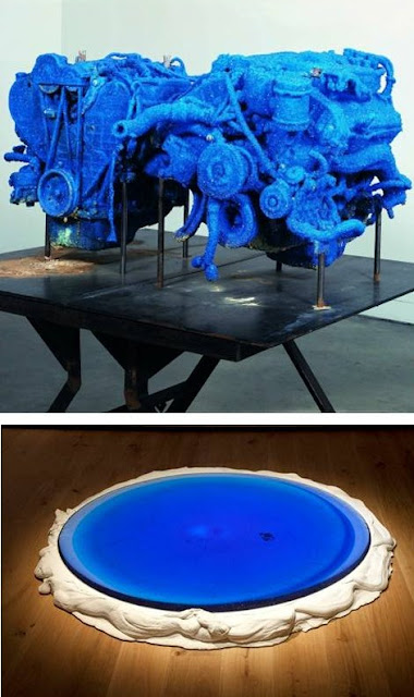
Roger Hiorns’ Nunhead (2004, below top), with engines covered in Copper sulphate crystals, is dramatic but hardly elemental.  Nor is Danny Lane’s Blue Moon (2015, below lower) made of glass with a Cobalt compound, also blue:


Heatherwick Studio’s Aluminium Billet 1: Extrusion 9, (2009, below top) comes with a video showing its fabrication in China, the country on whose nuclear power industry the UK will be increasingly reliant. Once we had our own, as Kate Williams’ and Keith Lloyd’s striking Uranium glass (well, uranium oxide probably) Nuclear Power Stations remind us; Springfield Nuclear Power Station (both 2006, left, below lower) and Dounreay Nuclear Power Station (right, below lower):


Whether David Nash was thinking about Carbon when he produced his charcoal Nature to Nature 4: pyramid, sphere, cube (1990/94, below top), we don’t know, but Tim Etchells was certainly thinking about Neon when he made something common in the universe but rare on earth (2015, below lower) for the show:


On the way in and out, you can hardly miss David Nash’s Big Black (2008-15, below) in carbonised California redwood:


There were some missed opportunities. I can understand that Damien Hirst’s For the Love of God (2007, left) in diamond and platinum might have been difficult to secure for this show, but something to underline diamond as another form of carbon, and introducing allotropy, seems appropriate. More feasible might have been one of Julian Opie’s computer animations like Marina in purple shawl (2010), visible in a post here last year, its LED screen being dependent on compounds of gallium, indium and other elements. I have jibbed a little at elements appearing in this show in the form of compounds, but the latter are the basis of most colour and pigmentation, and were much developed by 19th-century industrial chemists. As Pierre-Auguste Renoir said, “Without colours in tubes, there would be no Cézanne, no Monet, no Pissarro, and no Impressionism.”

Periodic Tales: The Art of the Elements ends on 13 December

* The exhibition catalogue in its Endnotes and elsewhere states that “The chemical elements are the fundamental building blocks of all matter”. “Up to a point, Lord Copper”, depending on what is meant by “fundamental” and “matter”. The chart below comes from Wikipedia:


The periodic table arranges the elements by their atomic number which is the number of protons in the nucleus. Protons and neutrons are the Nuclei in this chart above. An element has an equal number of protons and electrons. Protons are positively charged, electrons negatively. Electrons are a type of Lepton, see the chart. The periodic table groups the elements to reflect their electron configurations, when these are similar, the elements have similar properties, eg the noble gases, like neon. The same element can have different numbers of neutrons – isotopes of the same element. For example, most hydrogen on earth has just one proton and one electron, but it can have one neutron, when it is called deuterium, or two, tritium. Tritium, unlike deuterium, is unstable and decays to produce an isotope of helium – radioactivity.

** Or possibly Thirty Pieces of Silver (Exhaled) cake stand (2003).


9 November 2015

John Harris on Bristol and Plymouth

The Guardian last week ran a series of articles by John Harris on the future of cities – urban despatches from within the UK. As well as Bradford and Manchester, his articles covered the two cities of the South West region, Bristol and Plymouth. Knowing both fairly well, I thought his accounts of the situations they face were excellent and should be read by anyone with the least interest in either place or in the south west.

He didn’t say so specifically, but Plymouth in the past lacked a significant middle class, as is revealed by this description of its housing stock:
Part of Plymouth’s problem is that until recently, we only had 56 houses in Band H council tax – 90% of Plymothians live in either C, B or A. So our council tax base is low.
So it possibly has more in common with Liverpool than Bristol. Harris starts his Bristol piece:
“Bristol is perhaps the one southern city which really feels independent of London,” writes Owen Hatherley in his brilliant architectural travelogue A New Kind Of Bleak.
An endorsement which I’m not sure I support. To me Bristol seems to have an inferiority complex with regard to London which leads it to overcompensate. This may worsen when rail electrification reduces the travel time by 20 minutes - as a Mexican president said, “so far from God and so close to the United States”*. It could also be an alternative explanation to Harris’s when he observes:
Bristol was the only English city to vote for an elected mayor in the referendums that took place in 2012, something put down to the apparent chaos of its politics (between 2001 and 2011, the old city council was led by seven different people) and the city’s ancient fondness for doing its own thing.
At which point a key difference between Plymouth and Bristol should be made clear. The latter actually is a meaningful conurbation surrounded by rural Devon, whereas the city of Bristol is merely the core of a built-up area which extends seamlessly into South Gloucestershire and North East Somerset. It’s not just because of the topography that Bristol’s public transport is incoherent and inadequate for its size. North East Somerset includes Bath which, although much smaller than Bristol, doesn’t do anything to mitigate the latter’s inferiority complex. From 1974 to 1996, these areas were part of the county of Avon, abolished by John Major’s Conservative government and, if meaningful devolution is to take place in future, probably needs to be re-established.

An article earlier this year, Bristol, the European capital of green nannying and bureaucracy, by Anthony Whitehead, gives a resident’s view of current life in the city. I posted here last year about the Royal William Yard redevelopment in Plymouth to which Harris refers.


*If Bristol is too close to London, Plymouth is probably too far from the capital for its own good. The M5 stops at Exeter, Plymouth airport is mothballed – Newquay or Exeter are the nearest at present - and GWR electrification gets no closer than Bristol, although other more marginal improvements to the rail service are programmed. [Added 10 November].


7 November 2015

Superforecasting

I’m going to assume that anyone who reads this post has almost certainly been landed here by Google, and therefore is likely to be familiar with the Good Judgement Project (GJP), the brainchild of Professor Philip Tetlock at the University of Pennsylvania and described in his and Dan Gardner's recently published book, Superforecasting: The Art and Science of Prediction. So I won’t provide a description of the GJP or the book.

Before going any further, I should say that I participated in the last GJP tournament and my score over some 135 questions was undistinguished – well below that of the top 2% who Tetlock defines as superforecasters (SFs). So you are welcome to dismiss anything that follows as sour grapes.

Undoubtedly, the book has been reviewed with enthusiasm in the UK by, among others , John Rentoul (not once, not twice “a terrific piece of work that deserves to be widely read”, but three times), Dominic Cummings (“Everybody reading this could do one simple thing: ask their MP whether they have done Tetlock’s training programme.”), Daniel Finkelstein (“This book shows that you can be better at forecasting. Superforecasting is an indispensable guide to this indispensable activity.”) and Dominic Lawson (“fascinating and breezily written”).

A key point to appreciate about individual SFs is that their capability as forecasters is based not so much on what they know - the forecasting questions range widely, so being a subject matter expert is not an advantage - as the way they set about it.. Nor are SFs mostly in the IQ top 1% (135+) of the population, although they are in the top 20% for intelligence and knowledge (Page 109). However, they “are almost uniformly highly numerate people” (Page 130) and “embrace[d] probabilistic thinking” (Page 152). The other factors in their success and how anyone could set about improving their own forecasting skills is the subject of the book.

SFs, being numerate, will have no problem with the Brier scoring system used by the GJP. Brier scoring may well be an eye-glazing subject for most people, but it is one that ought to be understood if an appreciation of superforecasting is to be more than superficial. Hence the Annex below for anyone interested.

Superforecasting, having more significant issues to address, does not bother the reader with much on the way the Brier score is calculated, but it does feature on pages 167/8 when the importance of objectively updating forecasts in the light of new information is being emphasised. A GJP question being asked in the first week of January 2014 was whether “the number of Syrian refugees reported by the UN Refugee Agency as of 1 April 2014” would be under 2.6 million. This chart* from page 167 shows successive forecasts made by one SF, Tim:


On page 168 the reader is told that “Tim’s final Brier score was an impressive 0.07.” The smaller the Brier Score, the better the forecast, of course. By my reckoning, that is the score which Tim would have received if he had made an initial forecast of 81% probability of the answer to the question being “Yes” and stuck with it. But, as is clear, he started with slightly better than evens in early January and then moved towards certainty in late March, thereby achieving SF status, on this as on many other questions.

But what if the UNRA had needed its forecast in January for planning purposes and a more accurate forecast in March would have been too late? The next chart attempts to break out Tim’s forecasts on a monthly basis. 


For January it looks as though Tim’s average probability was about 67% so the Brier Score for this month would have been a 0.22, rather poorer than the glittering 0.07. The GJP methodology is time-independent in the sense that it does not attach a greater value (weighting) to early forecasts as opposed to later ones. It might be interesting to see the effect of some discounting, as in (but opposite in time to) Discounted Cash Flow where early cash flows are valued more highly than late ones. This would seem appropriate if an important driver of a real-world forecast is someone’s need to make decisions well before outcomes are known.


Another time-related aspect of the GJP scoring is the termination date of the question. A scenario from the past might be helpful. On 30 September 1938 the leaders of Britain, France, Germany and Italy signed the Munich Pact allowing German occupation of the Sudetenland. The British Prime Minister, Neville Chamberlain, returned to London (above) where he was greeted by enthusiastic crowds and spoke of “peace for our time”. However, Churchill said that “England … has chosen shame, and will get war”. So a GJP question in October 1938 might well have asked “Will Britain and Germany be at war by 31 August 1939?”.

A Chamberlain supporter would have started his (or her) answer at a probability much less than 50%, a Churchill supporter at a substantially higher one. As the events of 1939 unfolded, both parties would probably have increased their estimates. However, when the question closed, the Chamberlain supporter would certainly have had the lower Brier Score. Of course, if the question had been “Will Britain and Germany be at war by 30 September 1939?”, their Brier Scores would have been reversed** and the Churchill supporter’s initial pessimism would have been vindicated. So, depending on the date of the question to within just a few days, a good (ie low) Brier Score can be obtained for questionable judgement in a broader sense. There were 135 questions in the recent GJP tournament, 23 of those ended on 31 May and another 39 between 1 and 10 June, dates which probably have more to do with Penn U’s academic year than geopolitics.

It is probably worth bearing in mind that SFs are people adept at minimising time-independent Brier Scores on questions which terminate on arbitrary dates and that is the basis on which their ability as forecasters has been assessed.

As pointed out earlier, the reviews of Superforecasting have been enthusiastic and keen to see its approach being adopted in business and government. I came across this interesting comment on Forbes/Pharma & Healthcare by an admiring reviewer, Frank David, who works in biomedical R&D:
So, companies may be able to nurture more “superforecasters” – but how can they maximize their impact within the organization? One logical strategy might be to assemble these lone-wolf prediction savants into “superteams” – and in fact, coalitions of the highest-performing predictors did outperform individual “superforecasters”. However, this was only true if the groups also had additional attributes, like a “culture of sharing” and diligent attention to avoiding “groupthink” among their members, none of which can be taken for granted, especially in a large organization.“ A busy executive might think “I want some of those” and imagine the recipe is straightforward,” Tetlock wryly observes about these “superteams”. “Sadly, it isn’t that simple.” 
A bigger question for companies is whether even individual “superforecasters” could survive the toxic trappings of modern corporate life. The GJP’s experimental bubble lacked the competitive promotion policies, dysfunctional managers, bonus-defining annual reviews and forced rankings that complicate the pure, single-minded quest for fact-based decision-making in many organizations. All too often, as Tetlock ruefully notes, “the goal of forecasting is not to see what’s coming. It is to advance the interest of the forecaster and the forecaster’s tribe,” [original emphasis] and it’s likely many would find it difficult to reconcile the key tenets of “superforecasting” with their personal and professional aspirations.
Very likely - “the toxic trappings of modern corporate life” - how true indeed.


* I may be taking the chart on page 167 too seriously, but a couple of points. The grey space above a probability of 1 is ,of course, just artistic licence. However, I don’t understand (apart from further artistic licence) why the successive forecasts have been joined by straight lines as shown. Surely a forecast remains extant until it is superseded by the next one, and the forecast line is a series of steps, as shown for January 2014 below?


** US readers, and this blog has a few, may need to be reminded that the UK declared war on Germany on 3 September 1939. Germany declared war on the USA on 11 December 1941.


Only superforecasters working in teams are likely to approach perfection - please let me know by commenting if you spot any mistakes in this post!


ANNEX


The red line is the Brier Score, S, as a function of (1-p), the dotted line for comparison is S = (1-p).


UPDATE 30 JUNE 2016

The Superforecasters' prediction for the UK "Brexit" referendum earlier this month was less than stellar - see this post.


2 November 2015

British Sculpture 1950-2015 at Chatsworth

Since 2006, Sotheby’s have staged annual selling exhibitions of sculpture, Beyond Limits, in the grounds of Chatsworth House, the ancestral seat of the Duke and Duchess of Devonshire and a masterpiece of English baroque architecture. This year’s tenth anniversary exhibition was Beyond Limits: The Landscape of British Sculpture 1950-2015 which ran from 14 September to 25 October. Tim Marlow, Artistic Director at the Royal Academy was the guest curator and also author of an essay for the exhibition catalogue, A Topography of British Sculpture. The sculptures were not arranged at Chatworth in a chronological sequence but the approach in Marlow’s essay was primarily historical and is echoed here.

Marlow starts his survey by identifying Henry Moore and Barbara Hepworth as the ‘presiding spirits’ who led post-war British sculpture into the Modernist and post-Modernist mainstream of Western art. One of the inevitable shortcomings of the recent Tate Britain Hepworth show was its inability to place Hepworth’s larger works outdoors, something which Beyond Limits was well-placed to rectify with three pieces: Sea Form Atlantic (1964, below top left), Three Obliques (Walk In) (1969, below lower) and The Family of Man: Figure 1, Ancestor 1 (1972, below top right with Three Obliques (Walk In) in the distance).


After appearing in the British Pavilion at the 1952 Venice Biennale, a group of some younger sculptors became associated with the ‘Geometry of Fear’; for example, Reg Butler (Manipulator,1954, below left) and Lynn Chadwick (Pair of Walking Figures – Jubilee, 1977, below right):


It was in the 1960s that it became apparent that a serious, internationally respected but fundamentally British tradition” of sculpture had emerged, something which in Marlow’s view “became one of the great, yet understated, success stories of post-war British culture". Talents which emerged at this time included Kenneth Armitage (Monitor, 1961, below top) and William Tucker, whose Genghis Kahn (1963, below lower) seems ahead of its time:


Anthony Caro (Sunshine, 1964, below left) had a major exhibition at Chatsworth in 2012 while a post here recently covered the current Arnolfini Richard Long show (Cornwall Slate Line, 1990, below right):


The 1980s, the period of the 'New British Sculpture', saw the emergence of major figures such as Anish Kapoor and Antony Gormley. Gormley’ s Big Gauge II (2014, below top left), Tony Cragg’s Manipulation (2008, below top right) and Stephen Cox’s Kiefer-like Dreadnought: The Problems of History - The Search for the Hidden Stone (1990 to 2015, below lower) are later works.


The prominence of the YBAs since the nineties was reflected in Beyond Limits, though I don’t altogether share Marlow’s enthusiasm for Hurst. Sarah Lucas’s Florian and Kevin (2013, below upper and lower respectively) were produced at Pangolin.


Gavin Turk’s Habitat (Burgundy) (2004, below left) and American Bag (2015, below right), contrary to appearance, are painted bronzes, not as impressive as his Nomad, seen at Crucible2 last year.


Marlow’s survey finishes with two complex works, both with archaic resonance, Thomas Houseago’s Hermaphrodite (2011, below left) and Bill Woodrow’s Regardless of History (1998, below right):


Two pieces which were not specifically mentioned by Marlow were Bernard Meadows’ Large Standing Armed Figure (1962, below left) and the recent Conrad Shawcross, The Dappled Light of the Sun, I-III (2015, part below right):


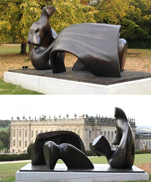
To end where the survey began, two views of a fine Henry Moore, Three Piece Reclining Figure: Draped (1975):