In this tale of two middle classes, doctors, barristers and London's financial services workers emerge as the big winners. But this "über-middle" is dwarfed by a much larger group of "cling-ons" who have seen their relative position dramatically worsen even during the years of economic boom. The data, prepared for the FT by two of the nation's foremost labour market economists, Professors Brian Bell and Stephen Machin, shines a light on the shifting fortunes of the professional middle class.Actually, there wasn’t that much data. From page 1 and supplementary material on page 2 under the heading The fractured middle, the reader can pull together the following:
There was also a graphic, Winners and losers: how professional salaries have changed over the decades, adding data for 1994 and for more occupations but using the somewhat opaque statistic of ‘Ratio of mean earnings for each profession compared with the top 10% of earners’:

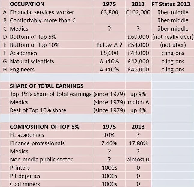
The only two occupations which have pulled ahead are London finance and Medical practitioners. I was not surprised to read that:
Underpinning this shake-up in the top tier of society is a severing of the bond that for decades tied the top 1 per cent of earners to the 1 per cent below them. Since 1979, the very highest earners have increased their share of total earnings by almost nine percentage points while the rest of the top 10 per cent have captured only an extra four percentage points.- hardly a revelation. In 2011 Will Hutton’s final report of the Review of Fair Pay in the public sector was published and it showed that the top 1% had been moving ahead since 1980:

in the UK and US that is. And from everybody else in the UK:

But I was surprised to read in the FT:
Doctors, Prof Bell pointed out, were the only group of public sector workers to have done well" "Public sector workers have almost disappeared from the top of the income distribution,"…because Hutton’s Review had stated that
… public sector employees represent around seven per cent of the highest one per cent of earners [although] those seven per cent only receive one per cent of top earnings. Approximately one in 85 workers in the private sector earn over £150,000 a year, compared to just one in 280 public sector workers. (pages 17/18, 2009 figures)Top civil servants had certainly done less well than local authority chief executives who, in turn, had failed to keep up with private sector chief executives:

Hutton thought that when comparing budgets in the public sector and turnover in the private, together with “analyses of job size and complexity [it was still consistently found] that public sector roles pay considerably less than equivalent roles in the private sector” and produced a chart to back that up:

Hutton admitted that:
Simple comparisons of organisation size of course mask very real differences in the size of the role of the leader in what are very different types of organisation; and it may be objected that any private sector CEO can only be paid if his or her organisation is profitable - a crucial test that does not apply to the public sector.Not the only objection I would have thought. Take the position of university vice-chancellors as reported in the Times Higher Education Supplement last year:
The vice-chancellor with the highest salary in 2011-12 was the University of Birmingham’s David Eastwood, who took home £372,000 in basic pay; he also collected £34,000 in pension contributions. (However, the highest remuneration package overall went to the University of Oxford’s Andrew Hamilton – [£371,000 salary, unknown expenses, £53,000 pension]. That is dwarfed by the remuneration awarded to Mark Allan, chief executive of student housing company Unite Group. According to Unite’s accounts, he received not only £393,000 in basic pay but also a £428,370 performance- related bonus and £78,600 in pension contributions for the year ended February 2012 - a total package of almost £900,000, not including long-term share options. The FTSE 250 company’s annual income of £219.5 million is less than half of Birmingham’s £472 million income in 2011-12 and only about a fifth of the University of Oxford’s £1 billion income over the same period. Oxford’s Hamilton received £371,000 in basic pay and £53,000 in pension contributions in 2011-12, less than half Allan’s income.
But is the comparison with the private sector reasonable? While vice-chancellors might increasingly need to act like CEOs, captains of industry would surely claim that their business models - and levels of risk - are nothing like the work of politically protected institutions largely reliant on public funds (regardless of whether that money flows through research and teaching grants or state-subsidised student loans).To appreciate what might be meant by "levels of risk", consider the Bath/Bristol area of SW England where there are four universities within a 12km radius:

and whose vice-chancellors were rewarded as in the table below in 2011-2012:

In similar geographical circumstances in the private sector, one can’t help thinking that the vice-chancellor equivalents would be under pressure from institutional shareholders and, more scarily, private equity to rationalise to reduce overheads in what are very similar areas of business and increase profitability. This table certainly brings out the FT’s point that the average academic is now what they charmingly describe as a cling-on. Professors are hardly in the über-middle. The FT also pointed out the concentration of the best paid jobs of all kinds in London and the southeast. The further the cling-ons are from that region, the better off they probably feel. However, housing costs across a large part of southern England are driven by a London effect extending into the South West , as shown by this map produced by Neil Hudson of Savills Research last year:

*Why the FT chose “cling-on”, as opposed to “unter-middle” (or unter-Mitte even), wasn’t explained – perhaps too close to Untermenschen. Anyway that’s where I put myself, for sure!
UPDATE 18 APRIL
Some data from Bell and Machin here.
No comments:
Post a Comment